
I‘ve been thinking a lot about colour recently. Perhaps because I’ve been making colourful hexagons for a few weeks ahead of the launch of The Hexagon Project 2014 which I blogged about yesterday here: https://agrarianartisan.com/2014/01/31/the-hexagon-project-2014/
I like to think I use a subtle colour palette in what I do. If you saw my home youwould see it is fairly modern with plenty of oak and neutral shades everywhere – just odd splashes of colour for accent. But I do love colour in many things, just as long as it isn’t glaring out at me from every corner. So I am not afraid to use colour provided it fits in my world.
You won’t find much multi colours in anything I make or design – just look at my Ravelry project and design pages to see how I use colour!
However, my thoughts have made me reflect on the blankets I have made over the years.
The first blanket I ever made was a granny in shades of blue, mainly pale blue. It served me well at uni. It was thrown out years ago – so I don’t have a photo of it. Believe me when I say it was subtle, not glaring.
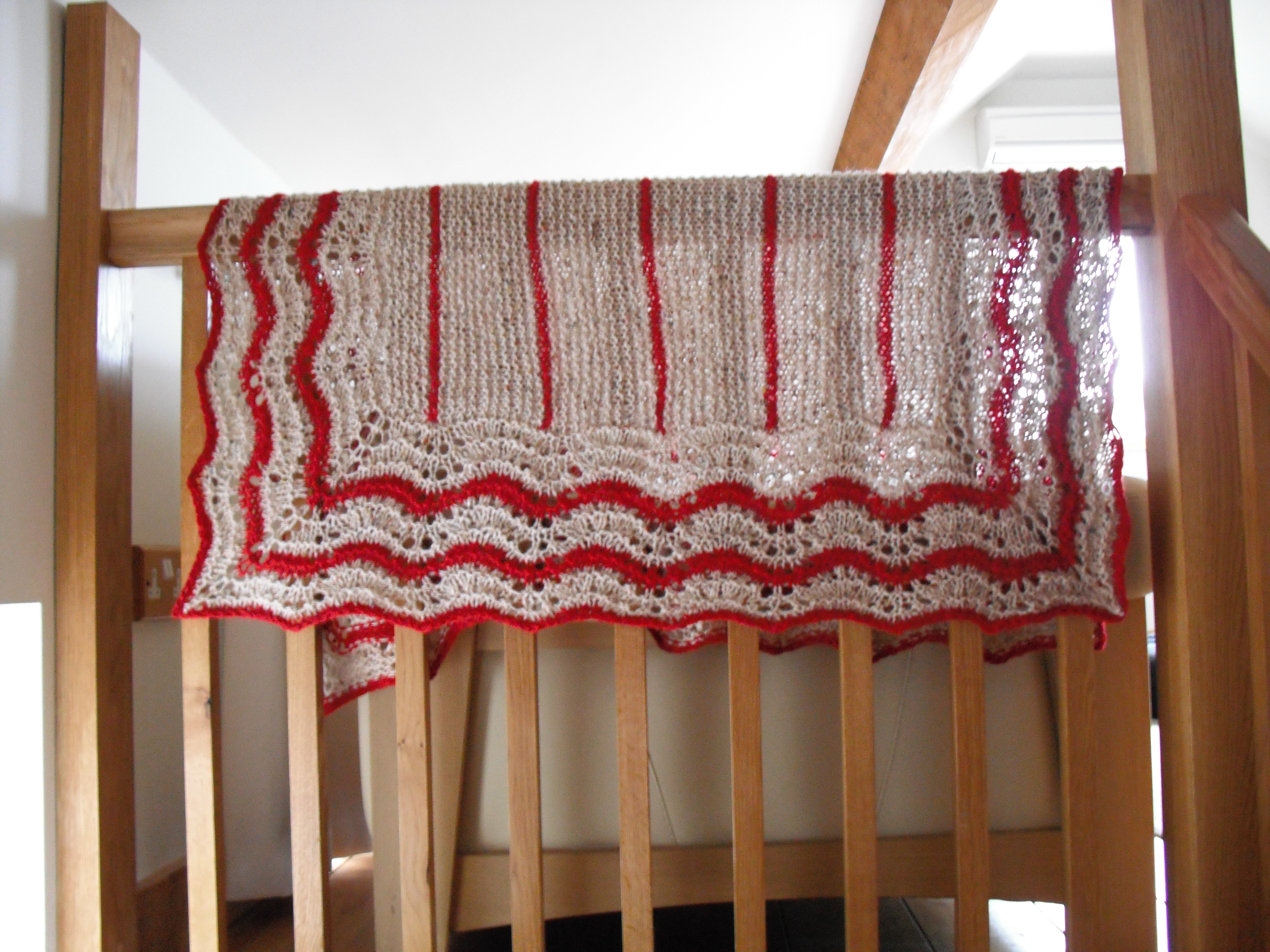
The second blanket I made was a small knitted hap blanket – beige with red highlights.
Then came Starry Night by Amanda Perkins, I made it in grey, silver and 2 shades of dark blue.

The fourth blanket I made was another design by Amanda Perkins called Lily. This time I started to use more colour – I wanted lots of red – and that is what I got!

The next blanket (knitted) was back to my neutral shades.

Then no 6 was a baby blanket in ice cream colours
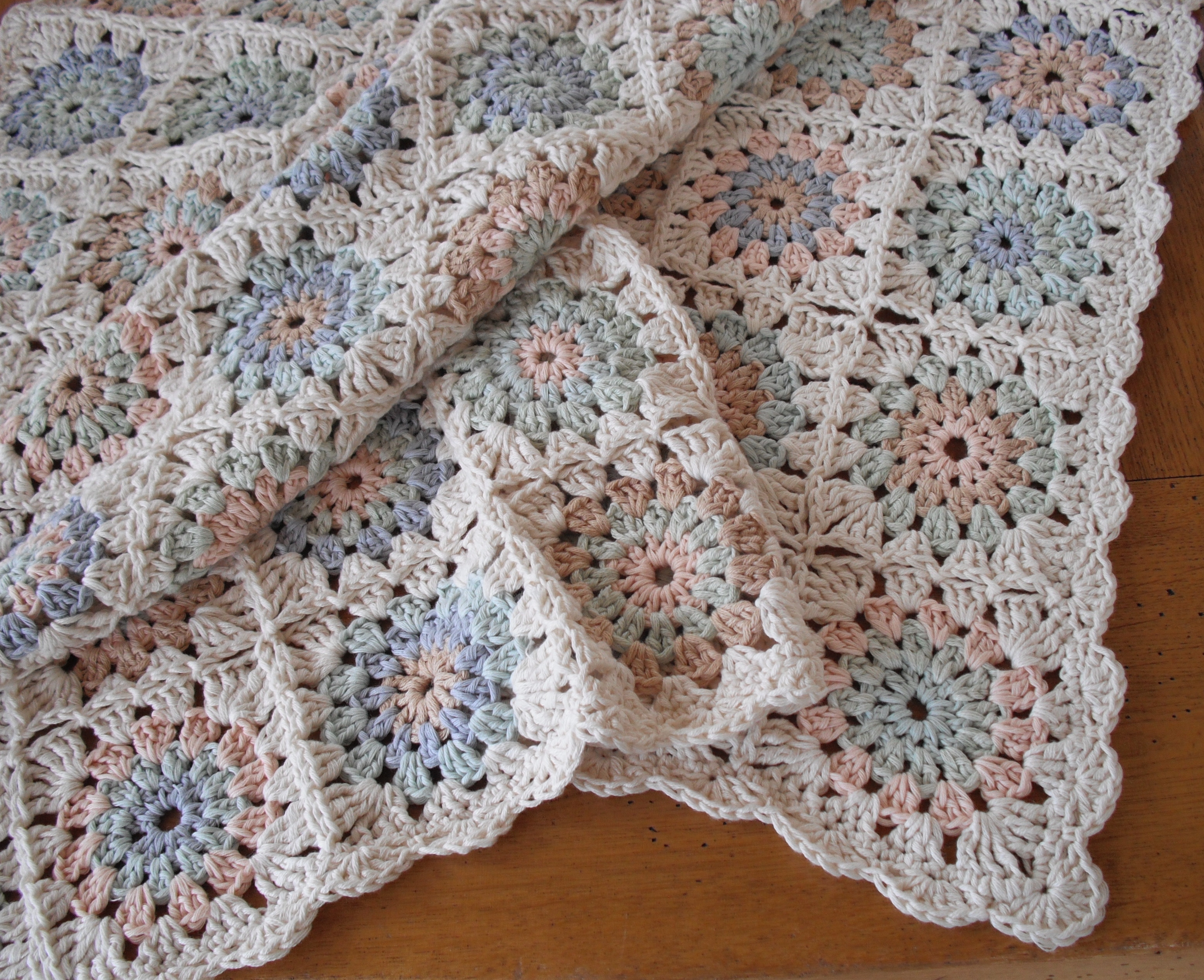
And then a small lap blanket in soft blue, green, cream.

Then I made a granny style blanket in lots of colour – quite a change for me! It is confined to the spare bed and is very practical. But I do quite like the colour pick-me-up as I walk in that room.

The first blanket for this year is very colourful, it is another Amanda Perkins’ design and I blogged about it here: https://agrarianartisan.com/2014/01/25/kaleidoscope/
I have also made 2 other blankets recently, I’m not going to tell you about them yet, other than to say one is ‘nicely’ colourful and the other is back to my more subtle colour palette.
Now all of this has made me think about the world of crochet. There are so many fields of crochet in the world from the delicate old Irish crochet used frequently in crisp white doillies to the bright colourful world of simple but effective granny squares, with a myriad of styles, taste and colour inbetween. The recent growth in the crochet world has been predominantly in the colourful granny area – after all it is easy to see the impact of colour and grannies are quite quick and easy to make when you are just getting going.
Just recently I have started to sense a slow change in that colourful granny world, maybe, just maybe, it is growing closer to my preferences of subtlety. I think it is about time it should.
Personally, in the world of colourful crochet my preference is always in the direction of Amanda Perkins, her use of colour is exceptional. It is so much more sophisticated than the granny world. If we are to use colour in the world of crochet it is much better to do with sophistication don’t you think?
Yes, I would dearly love to know what you think, so please share your thoughts with me.
Happy crocheting xx
Edit: just after pushing the ‘publish’ button, I read the latest blog by Lucy of Attic 24 which only served to confirm my sense of colour shift! http://attic24.typepad.com/weblog/2014/02/colour-play.html

I love this design, simple lovely colours